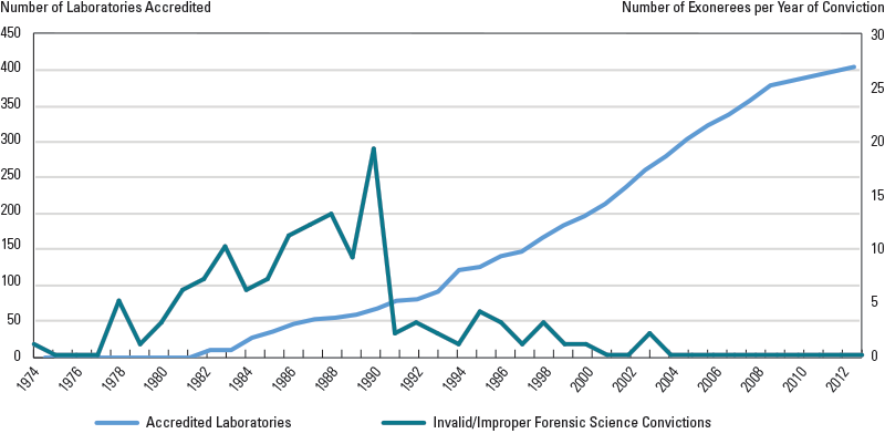
Figure 3. Number of Laboratories Accredited Per Year vs. Number of Exonerations (Year of Conviction)
Figure 3 is a line graph showing the number of laboratories accredited per year versus the number of exonerations per year of conviction. The figure shows an increase in the number of accredited laboratories compared to the number of exonerees per year of conviction.
The data points shown on the line graph are as follows:
| Year | Number of Accredited Laboratories | Number of Invalid/Improper Forensic Science Convictions |
|---|---|---|
| 1974 | 0 | 1 |
| 1975 | 0 | 0 |
| 1976 | 0 | 0 |
| 1977 | 0 | 0 |
| 1978 | 0 | 5 |
| 1979 | 0 | 1 |
| 1980 | 0 | 3 |
| 1981 | 0 | 6 |
| 1982 | 10 | 7 |
| 1983 | 12 | 10 |
| 1984 | 29 | 6 |
| 1985 | 36 | 7 |
| 1986 | 48 | 11 |
| 1987 | 53 | 12 |
| 1988 | 56 | 13 |
| 1989 | 61 | 9 |
| 1990 | 69 | 19 |
| 1991 | 80 | 2 |
| 1992 | 81 | 3 |
| 1993 | 93 | 2 |
| 1994 | 121 | 1 |
| 1995 | 127 | 4 |
| 1996 | 141 | 3 |
| 1997 | 147 | 1 |
| 1998 | 166 | 3 |
| 1999 | 184 | 1 |
| 2000 | 196 | 1 |
| 2001 | 214 | 0 |
| 2002 | 238 | 0 |
| 2003 | 260 | 2 |
| 2004 | 279 | 0 |
| 2005 | 303 | 0 |
| 2006 | 323 | 0 |
| 2007 | 338 | 0 |
| 2008 | 356 | 0 |
| 2009 | 377 | 0 |
| 2010 | 385 | 0 |
| 2011 | 390 | 0 |
| 2012 | 397 | 0 |
| 2013 | 404 | 0 |
| 2014 | 0 | 0 |
| 2015 | 0 | 0 |
Data are based on 133 cases of wrongful conviction listed by the National Registry of Exonerations.


